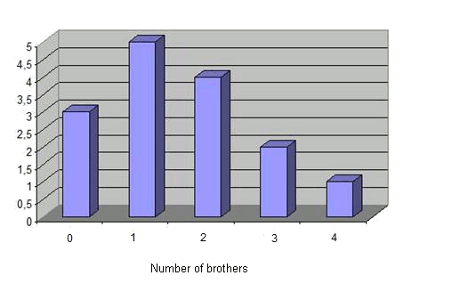
Bars diagram
The bars diagram shows the absolute frequencies of some data. The higher the bar, the more the corresponding value is repeated.
The following figure shows the diagram of this following example:
$$15$$ students answer the question on how many brothers or sisters they have. The answers are $$$1, 1, 2, 0, 3, 2, 1, 4, 2, 3, 1, 0, 0, 1, 2$$$ Then, we can construct a table of frequencies
| Brothers | Absolute frequency $$f_i$$ |
| $$0$$ | $$3$$ |
| $$1$$ | $$5$$ |
| $$2$$ | $$4$$ |
| $$3$$ | $$2$$ |
| $$4$$ | $$1$$ |
| $$\sum$$ | $$15$$ |
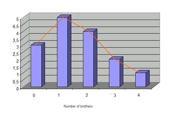
Polygon of frequencies
By joining the middle point of the top of every bar in the bars diagram, we obtain the polygon of frequencies (in orange). Using this example:
$$15$$ students answer the question of how many brothers or sisters they have. The answers are $$$1, 1, 2, 0, 3, 2, 1, 4, 2, 3, 1, 0, 0, 1, 2$$$ Then, we can construct a table of frequencies
| Brothers | Absolute frequency $$f_i$$ |
| $$0$$ | $$3$$ |
| $$1$$ | $$5$$ |
| $$2$$ | $$4$$ |
| $$3$$ | $$2$$ |
| $$4$$ | $$1$$ |
| $$\sum$$ | $$15$$ |